Golden hour / blue hour / overcast — pick a render mood for your client deck
Last updated: 3 October 2026
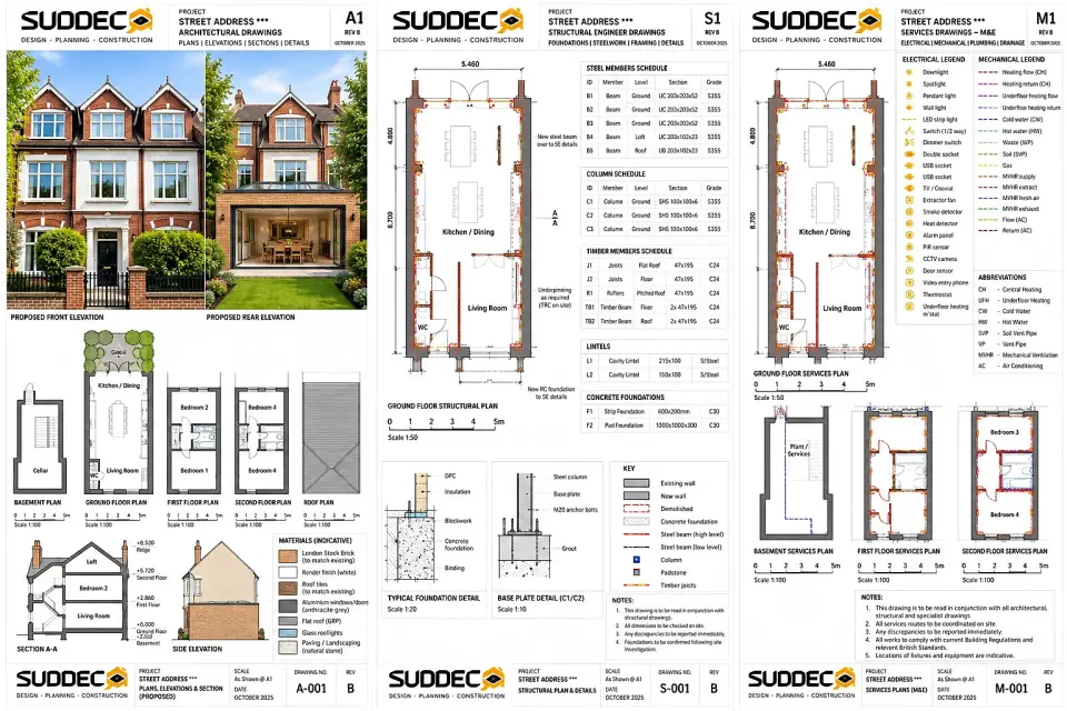
See it for your own home: put in your address and get free concept drawings and an indicative price. Get my free concept →
Lighting changes everything about how a room is read. The same kitchen with the same cabinets, the same stone and the same lighting design can look warm and generous, or flat and cold, depending only on the light falling into it.
That is why a good render is presented in more than one mood. You are not choosing a filter to make the scheme look better; you are checking that it holds up in the conditions you will actually live in — a bright summer afternoon, a grey Tuesday in February, and an evening with the lights on.
This guide covers the seven moods we render, what each one is good at showing, and where each one flatters a scheme rather than describing it.
The seven moods
| Mood | Light | Best at showing |
|---|---|---|
| Golden hour | Warm, low, west-facing | Warmth, timber, connection to the garden |
| Blue hour | Cool dusk, interiors lit | Architectural form and lighting layers |
| Summer midday | Bright, even, high | True material colour and finish |
| Overcast | Soft, diffuse, shadowless | Texture, grain and surface quality |
| Winter snow | Muted exterior, warm interior | Comfort and contrast against the weather |
| Night, interior lit | No daylight, artificial only | The lighting design on its own |
| Spring morning | Soft, high-key, slightly cool | Freshness, pale schemes, glazing |
Golden hour: the hero image
Golden hour is the low, warm, directional light of early morning or late afternoon. It is the mood most homeowners choose as the lead image, and for a good reason: warm light flatters timber, stone, brass and painted surfaces, and it makes any room feel as though it is being well used.
It is particularly effective for a rear extension or a kitchen-diner, where the light coming in from the garden is the point of the project. A golden-hour render shows the connection between inside and out, the depth of the glazing reveal, and the way the floor carries light into the room. If your project is a side return, a rear extension or a set of bi-fold doors, this is the mood that demonstrates why.
It is also the mood that flatters most. Warm directional light softens imperfect junctions, blends materials and makes a plain scheme look richer than it will at 3pm in November. Use it as the hero, not as the only view.
Blue hour: the architectural image
Blue hour is the short window after sunset when the sky is still luminous and interior lights are on. It is the most architectural mood in the set, because it removes the daylight that normally dominates and lets the lighting design do the work.
It is the best mood in which to judge lighting layers. A blue-hour render shows whether the task, ambient and accent layers balance, whether the plinth glow reads as a halo or a stripe, and whether the exterior and interior relate properly through the glazing. Where a scheme includes a lot of glass, blue hour is often the most convincing image in the deck.
The risk is that it looks better than reality. In a real room, blue hour lasts twenty minutes. Use it to check the lighting design, not to represent the everyday experience of the space.
Summer midday: the honest image
Bright, high, even daylight is the least flattering and most useful mood. It reveals the true colour of every surface — the actual grey of a window frame, the actual tone of a floor, the actual temperature of a white wall — without warm light or shadow to improve it.
Where a scheme involves deciding between two similar materials, midday is the mood to compare them in. A white worktop against an off-white cabinet, or two greys that look identical in a warm render, separate immediately under flat bright light.
It is also the mood in which weak junctions show. A shadow gap that reads crisp under warm low light can look inconsistent under even midday light, and a filler piece that disappears at dusk is visible at noon.
Overcast: the texture image
Overcast light is soft and diffuse, with almost no directional shadow. It is the best mood for showing texture: the grain of timber, the surface of plaster, the weave of a fabric, the variation in a stone.
It is also the most realistic mood for a London project, because overcast is the prevailing condition for much of the year. A room that looks good in an overcast render will look good in most weather. Where a scheme relies on strong shadow for its effect, an overcast render will tell you whether there is enough else going on.
Use it to check finishes you are specifying for their surface quality rather than their colour, and to sanity-check a scheme that looks wonderful in golden hour.
Winter snow and night, interior lit
Winter snow is an emotional mood: a muted, cold exterior with a warm, bright interior. It is used for exterior images of extensions and garden rooms, where the contrast between the weather and the interior is the message. It is effective and it is honest as long as you are clear that it is an emotional image rather than a technical one.
Night with the interior lit is the practical counterpart to blue hour. There is no daylight residue at all, so the render shows precisely what the artificial lighting does — where the pools of light fall, where the dark patches are, and whether the scheme works with the curtains closed. It is the mood in which underlit corners and over-bright worktops become obvious.
Spring morning
A soft, high-key, slightly cool morning light suits pale schemes, light timber and rooms where glazing is the main feature. It reads fresh and calm, and it is a useful counterpoint to the warmer moods when presenting a scheme that is deliberately restrained.
It is less useful for rich or dark schemes, where it drains the depth out of the materials. If your palette is dark joinery, brass and stone, spring morning will not show it at its best — but it is still worth seeing once, because a room that only works at dusk is a room that will disappoint its owner at breakfast.
How to choose — and what to avoid
- Choose two moods, not one. A warm hero image plus an honest midday or overcast view is the most useful pairing.
- Match the mood to the decision. Materials: midday or overcast. Lighting design: night or blue hour. Garden connection: golden hour.
- Check the orientation. A north-facing London room receives very little direct light, so plan and render it for the diffuse condition it will actually have.
- Do not use mood to hide a problem. If a junction or a material only works in one lighting condition, fix the design rather than the image.
We re-light any finished render in these moods while preserving the geometry, materials, joinery and furniture exactly, so the comparison is honest. Our design and build team uses the mood set alongside the technical drawings, and our drawing service produces the plans the render has to agree with. We work across Islington and Greater London, and how the process runs from drawing to priced scope is set out on our how it works page.
Frequently asked questions
Which lighting mood should I use for a kitchen or living space render?
Golden hour for the hero image and blue hour when the interior lighting and materials should read at their most architectural. Use summer midday to prove the material specification, and overcast to show texture without strong shadows.
Can changing the lighting mood hide problems in a design?
It can — which is why we render the same scheme in more than one mood. If a design only works under one lighting condition, that is worth discovering before construction rather than after.
Does re-lighting a render change the design?
No. Only the light changes; the geometry, materials, joinery and furniture stay exactly as modelled. That is what makes a multi-mood set a fair comparison.
Why does my room look different from the render in winter?
Most renders use bright daylight, and a London winter delivers far less of it — especially in north-facing rooms. Design the lighting layers for an overcast January afternoon and treat the bright render as the best case.
Should a render show the garden as well as the interior?
For any project that changes the rear elevation, yes. The interior-to-garden relationship is a main reason people extend, and it is the thing a floor plan cannot show. It also helps you judge the glazing orientation.
Related reading
- House renovation cost per square metre
- Kitchen extension cost: the complete 2026 guide
- Design and build service
- Architectural drawings and visualisation
- How Suddeco Homes works
See your scheme in seven moods
We re-light your finished render in every mood while preserving the geometry, materials and furniture.
Get your free concept →